Back in October 2020, with the introduction of Crisis Dashboard, we launched Timeline to help you bring public interest and media interest together to give you a full understanding of any crisis, event, or trend. From today, Timeline can be added to any dashboard — new or old.
Timeline was hugely popular when it launched with Crisis Dashboard, and the feedback we received on it told us that you wanted it on many of your existing monitoring dashboards too, because it gave you a visual overview of public engagement at a glance. So with this update, you can now add Timeline, or any widget, to any dashboard.
To help make it easier for you to use Timeline, we have made updates to how the All Searches view works when you have more than one search in your dashboard. We’ve also made it easier to get started with our dashboard templates. Here’s what else is new.
Compare searches with the new Combined Timelines widget
When you add more than one search to a dashboard, you can use the All Searches view to put all widgets from each search together in one view.
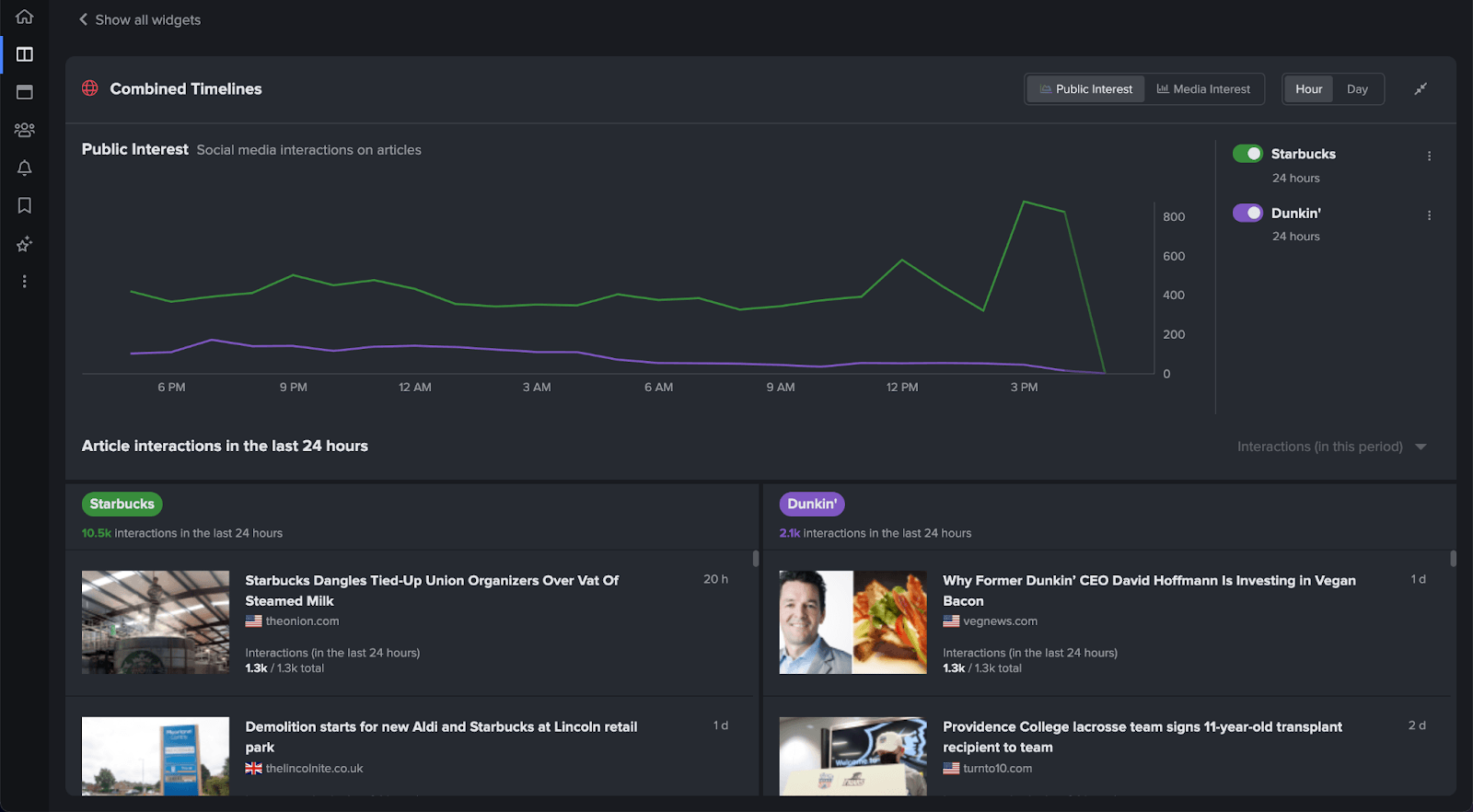
If you have a Timeline widget in more than one of your search panels, you will now get the Combined Timelines widget. Combined Timelines widget allows you to view multiple timelines together in one widget to compare and contextualize the size and importance of a crisis, event, or trend.

If you only have one search with a Timeline, you will still see that on the All Searches view along with any other widgets from each search in your dashboard. You can also expand the Combined Timeline widget by clicking on the ![]() icon. The expanded view will give you a visual overview of public interest and a feed of media interest for each search, like below.
icon. The expanded view will give you a visual overview of public interest and a feed of media interest for each search, like below.
Quickly get started with dashboard templates
With the introduction of Timeline to every dashboard, we’ve also taken this opportunity to make it easier to get started on NewsWhip Spike with dashboard templates.

If you’re familiar with NewsWhip Spike, you can start from scratch with a custom dashboard. But for newcomers to NewsWhip Spike, such as new joiners to your team, there might be a question of where to start and which widgets to use. Our templates exist to give guidance on where to start.
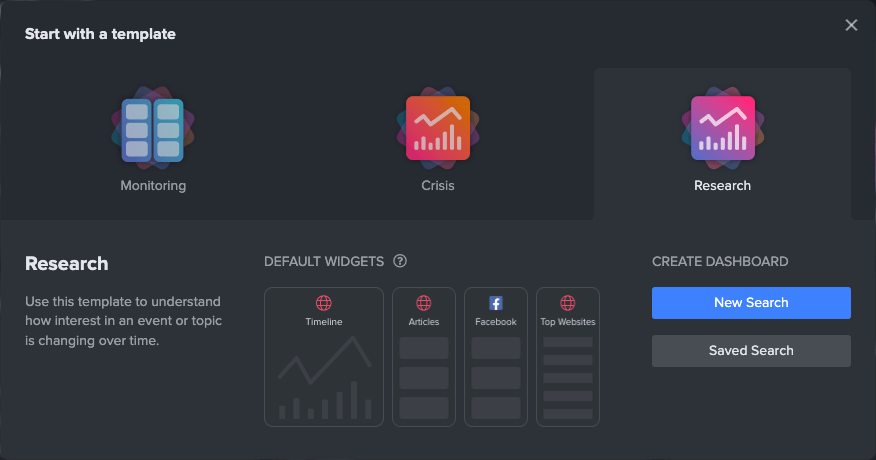
Each template is pre-populated with the widgets, metrics, and time range that our data tells us is best for whether you want to monitor a topic, research an event or trend, or manage a crisis. Once you start with a template, you can still edit that dashboard in any way you like to make it work best for you.
Now when you click on a dashboard template, you will get a visual preview of what is in each dashboard, like below.
If you’d like help adding the Timeline widget to your dashboards, you can email your Customer Success Manager by clicking here.


