new and improved
Real-time media monitoring
See the full story unfold with NewsWhip’s Timeline
NewsWhip’s enhanced social-first Timeline is your “God’s-eye” view of how stories emerge, gain momentum, and resonate with influencers and the public on all major platforms.
Map the rise and fall of stories across web and social
Imagine tracking a story from the moment it breaks on social media, such as X or Reddit, and then watching how it spreads across networks like Facebook, Instagram, TikTok, as well as web articles. NewsWhip’s enhanced Timeline enables you to monitor and analyze any story’s trajectory in real time, ensuring you never miss critical developments as they unfold.

Trusted by


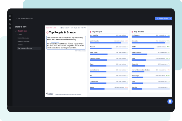
God’s-eye view
Social Interest
See how stories spread between social platforms
NewsWhip’s enhanced social-first Timeline enables users to track how stories travel through the complex, multi-platform ecosystem that defines today’s news consumption. Track how stories develop from their origins through different channels, gaining critical visibility into blind spots where narratives often emerge.


Public Interest
Understand public interest over time
Timeline gives you a precise overview of public interest in any crisis, event, or trend. By measuring social media engagement levels, you can see how public interest ebbs and flows — hour by hour and day by day, showing you how it is changing in real time.
Media Interest
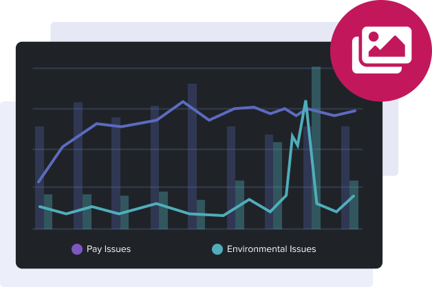
Measure the media’s output
Understand how much attention the media is paying to a crisis, event, or trend. With Timeline, you can see media output graphed by hour and by day, alongside the level of public interest in those stories.

Timeline is now more powerful than ever
Real-time Visualization
PREVIOUS PERIOD
Compare what’s happening now with what came before
Timeline Previous Period allows you to look at the previous period for the same search, whether that’s for the last day or month, giving you an easy point of reference.


TIMELINE COMPARE
Compare two or more events against each other
Compare allows you to visualize similar events against each other, giving you the context you need to make decisions.
TIMELINE NOTES
Highlight important information and events in-platform
Add annotations to the public and media graphs to draw attention to significant points of interest in the chart, so you can highlight important events and add insight for your team.


Historical Analysis
Live issues with historical context
With Historical Analysis you can widen the lens on real-time decision-making with up to 12-month time ranges on your search. With this paid add-on, you can see beyond the moment to navigate challenges with comprehensive context.
“Being able to go in and tag things for teammates to say ‘this is what you’re looking for, and this is where it happened’ is easier because it’s on the graph itself.”

Ally MacLellan
Manager Engagement & Platforms, Proof Strategies
Export and share your insight with the data
Report Builder
Transforming your dashboards into executive-level insights – instantly
Export to PNG - Quickly share updates with Timeline images
Download the public interest graph, the media interest chart, or both, in one PNG format file for easy sharing and quick updates for clients and colleagues.
Click here for an example.

Export to CSV - Dig into the data in Excel or Sheets
Export the data behind Timeline graphs, along with your Timeline Notes, into a CSV for use in Excel, Numbers, or Sheets, and combine Timeline data with other data sources from across your tech stack.
Click here for an example.
No more blind spots with NewsWhip
Are you struggling to understand what stories people are engaging with and what’s popular on different platforms? Then contact us today to learn more about NewsWhip’s unique social-first timeline. The only real-time visualization of the web and social.
Schedule a call with our team today to explore:
Contextualize time-sensitive issues
The need for a new approach to tracking information
How NewsWhip’s Timeline gives you the ‘god’s eye’ view


