Sharing of published content is exploding. How do you turn all those bursts of social traffic into readers and subscribers? First – how to look good on Facebook and Twitter, and encouraging shares from your site.
Publishers everywhere are experiencing growth in traffic from social. Trouble, is that traffic can be fleeting – readers click on a link they see in their timeline, read the story, and take off. If you’re a publisher, how do you turn more of those introductions into regular readers, even subscribers?
Based on our data and interviews with leaders in social news distribution, we’ve put together a logical five step guide to attracting and converting your social audience.
First, let’s look at how to make sure your content has maximum impact on Facebook and Twitter.
1. Think of Facebook and Twitter as your alternative front page
A new reader from a social network is going to be introduced to your content via social media: likely their Facebook feed or Twitter stream. How you present your content here matters a lot.
The presentation of a story is not just the headline – a glance at your newsfeed will confirm. Moreover, different networks present content in different ways. “We found that the packaging that works well on Facebook doesn’t always work as well on Twitter” says Daniel Mintz, Head of Data and Analytics at Upworthy.
Content will appear differently formatted on each platform, and each platform has different timing, dynamics, and audiences. First, Facebook.
A) Facebook
We can break the rules for sharing on Facebook into two parts: format, and timing/audience dynamics.
Format
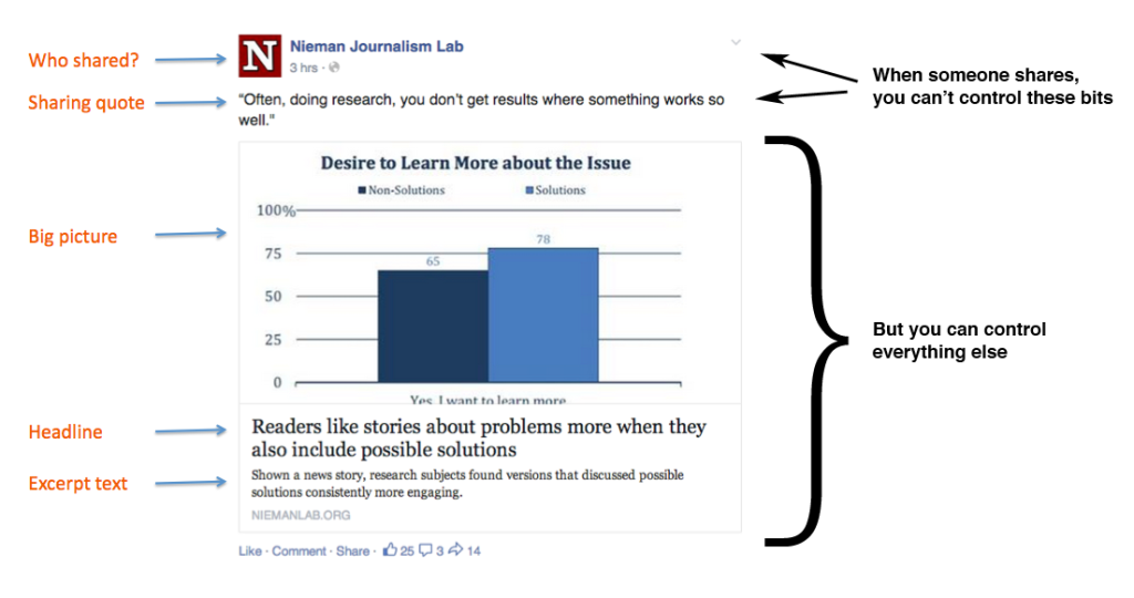
Dumping a link with a bland headline on Facebook, accompanied by a pixellated image, is not going to harvest you many new readers. Fortunately, you can edit the image, headline and summary that appear in the preview before posting to your page (above).
Once someone else starts to share your story though, you have no control over the description they write. The best you can do is optimise every other element of the preview, before people start sharing at all. Facebook advises that “shorter, succinct posts are better received.” The excerpt text doesn’t have to be about the story – Upworthy use the space to push their brand, with their tagline (“Things that Matter – Pass them on”). Basic open graph tags can be used in your site’s HTML to change what shows up for this default excerpt text, as well as the image preview, headline, author’s name, and more. These tags allow the Facebook crawler to generate better previews when your content is shared on Facebook.
(More on how to implement Facebook-specific open graph tags.)

Images
Once you’ve sorted out the text that appears when your post is shared, think about the accompanying image. According to Upworthy, “the share image is your in. Nobody cares about seeing your logo on a Facebook post. They want drama.” When you post a story to your page, you can change the accompanying image to whatever you like. There are two sizes of posts that Facebook will automatically revert to, depending on the size of the image.
Your pictures should be at least 1,200 x 630 pixels in order to generate a big, eye-catching preview. Any image under 600 x 315 pixels will lead to your preview being demoted, as follows:

Facebook has adjusted images’ aspect rations, so they are now the same for mobile and desktop. To minimise the risk of cropping, Facebook recommends keeping your image ratios as close to 1.91:1 as possible.
Even if you do opt to change your post image, pay attention to what comes up as the default – that’s what’s going to appear when anyone else shares the link. It might not be what you expect.
Even if you have an image that’s the right size for a large post, if it isn’t arresting or attractive, it’s not going to have the best chance possible of competing with all the other links in a reader’s news feed. Make sure interesting details are at the centre.

Video
Make use of the autoplay feature in videos uploaded directly to Facebook. There is evidence to suggest that these videos can attract as much, if not more, interaction that YouTube links.
Facebook recommends that when uploading videos, clips should have an aspect ratio no larger than 1,280 px wide, divisible by 16 px. The video should be less than 20 minutes long for maximum quality.
B) Timing and Audience
While you can’t control when all readers decide to share your stories, you can prime a flood of sharing by posting a great new story at the right time. If you have a Facebook page with over 50 likes, you can get some data on when that time might be, and what segments of your subscribers to target.
You can find the Insights tab at the top of your page.
Using Insights, you can track what posts are performing strongest, what’s attracting clicks or generating the most discussion. Insights shows you where your Facebook fans are based, and crucially, when the majority of them are online. Using knowledge gleaned from Insights, you can target your posts very specifically. When posting, you can target by location, language, interests, gender, age and more, using the little ‘target’ icon.
Another element of encouraging sharing is timing. Facebook’s algorithm will detect fast engagement around a post, boosting its presence in the feeds of friends-of-friends. Digital newsrooms are coming around to posting content based on their analytics. At the digital first Mirror.co.uk, the four main weekday peak times, with devices, are as follows:
7am – Mobile
Midday – Desktop
4.30pm – Desktop and Mobile
8pm – Mobile and Tablet
To respond to these surges in expectant visitors, the Mirror’s newsroom has big refreshes of content at each of these times. Posting new stories on Facebook at these times is part of that strategy.
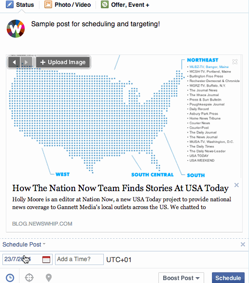
If you don’t have the resources of the likes of the Mirror, you can make use of Facebook’s scheduled posting feature to maximise your reach even when you’re away from your computer, using the calendar icon (see gif).
B) Twitter
Bringing in a new subscriber from Twitter involves some more strategizing. You’ll publish content, and it will be retweeted. What will be seen by your new potential subscribers?
Increasingly, the 140 character limit is just an anchor for more context, so you have options.
- Pin Tweets – This feature allows you to pin a popular or interesting tweet on top of your timeline. A good way to draw in a new potential follower inspecting your profile.
- Add a Gif to your article – As of last month, Twitter.com, Android and iOS Twitter apps support Gifs. Use free online tools gifninja and LiceCap. Gifs are eye catching for a new potential subscriber.
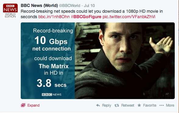
- Tweet Cards – Experiment with adding a card – an image with some data or quote – to your article tweet. This has been used with some success by Vox and NPR. Note that all the information on the card can be seen without the user having to even click the tweet.
- Headlines. You might have to characterise a story differently to bring readers from Twitter. “Twitter users are much less amenable to the curiosity type stuff than Facebook users” Daniel Mintz of UpWorthy told us. As we’ve seen in our own tool, Spike, users on the platforms tend to gravitate toward different categories of content, with Twitter heavy on breaking news or technology stories, for example.
- Images – PNG and JPEG images of up to 5MB can be posted to Twitter, and will be previewed in user’s timelines, increasing your visibility if you are retweeted. You can also upload up to four photos together in one tweet as a gallery, while only taking up 22 characters of your overall limit. When posting images, the same rules referred to above with Facebook generally apply. Use strong images, ideally at 440 x 220 px. Check what your tweets look like on mobile and desktop.
If your story doesn’t have the the reaction you were hoping for, wait a while, then repost, using a different angle. Pull out quotes, facts and statistics. Unlike Facebook, direct retweeting means that shares of your link can spread infinitely with the same message – your actual tweet text. On Facebook, everyone will be writing their own two cents.
With these steps in place, you’ll better achieve Goal One: getting a new potential reader to click your story when it appears in their social feed. This is just the beginning of your relationship with the new user.
2. Optimize for sharing: The share buttons debate and mobile audiences
Once people land through on your page and read the story or watch the video, you have two goals – to encourage them to share, and to convince them to become a regular subscriber. The second of those is more important, but let’s first look at how you can keep the shares rolling.
A) Social Sharing Buttons
While a portion of readers will always share the story themselves via old-fashioned copy and paste, many sites use prominent social buttons to nudge readers toward sharing their stories.
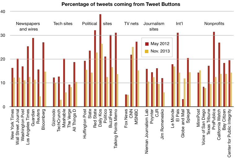
They can be a controversial feature. Some see them as distractions that clutter a perfectly well-designed webpage, while others view them as a vital tool for any social strategy. In a widely discussed 2012 blogpost, designer Oliver Reichenstein opined: “You don’t want a cheap thumbs up, you want your readers to talk about your content with their own voice.” Meanwhile, a Nieman Lab study into the effect of Tweet buttons (similar data was not available for other networks) showed that use of Tweet buttons on news sites declined significantly between 2012 and 2013, with an average of 12.61% of all tweets coming from the buttons in November 2013.
But if you want to get your content shared, you should be making it as easy as possible for the reader to do so. Giving options to the reader is a key part of influencing sharing behavior. Designer Martin Belam says share buttons serve as a “reminder to share at the ‘seducable moment'”, taking the friction away from potential linking.
There are two things to keep in mind when it comes to deciding on how to use share buttons:
Size: You’ll have to work your button designs into the layout of your site, but from looking at some of the most successful social leaders, bigger is better.
One popular trend involves simplifying sharing options to just the main networks, and providing direct instructions, at the bottom of each post. Several successful social sites use this method, from BuzzFeed and Upworthy to political sites such as The Blaze and Mother Jones, the latter of which saw an incredible 700% increase in their Facebook interactions from August 2013 to May 2014. If you’re going down this route, put in some robust, clickable buttons.
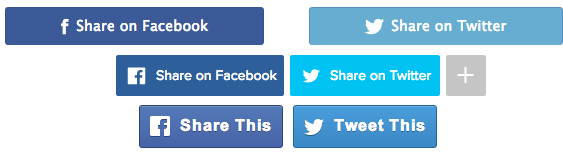
Placement: Where you put your share buttons is another debate – above, below, or on the side? Maybe have them jump out and grab the reader altogether (OK, that’s not possible yet.) While the sites we mentioned above use big, bold buttons, they almost all differed in where they placed them. One solution is to install a heat map, which tracks visitors’ scrolling behaviour, to review where might be the most effective place to insert the buttons on your page.
If you’re really serious about how effective your Tweet buttons are on your stories, try running this Ruby script to calculate a percentage of the total tweets that came from a particular button.
Make the “Nuggets” of a Story Shareable. In the same vein, consider making parts of the story (rather than just the headline) shareable. There may be several angles to your story – if the main headline isn’t of interest to some readers, other fact or quote might be. By scattering options to share throughout your post, pulling out different facts, quotes, or other talking points, you’re opening up new sharing potential in the story.
This is idea that emerged in the LA Times’ site redesign earlier this year, with each reporter obliged to come up with some Twitter-friendly one-liners to ‘sell’ the story, which appear on the page accompanied by share icons.
B) If it doesn’t work on mobile, it doesn’t work
To successfully engage with the growing numbers of mobile readers on your site, you’re going to have to factor them in from the start. Having a mobile preview built in to your Content Management System solves many of the problems of mobile compatibility before they even become an issue, forcing writers and editors to rethink the open-plan designs they had in mind for desktop.
When asking people to share, avoid language like ‘click here’. New forms of mobile-only sharing are on the rise. BuzzFeed and USA Today’s FTW Sports Blog says that WhatsApp sharing buttons are now more popular than Twitter buttons on their site, despite being completely unavailable on desktop. To try for yourself, you can implement your own WhatsApp button using this generator.
If you find that your share buttons are being neglected by visitors, don’t panic. Mobile users will likely be using the browser-based share functions to share directly, bypassing whatever is hosted on your site. Also, remember that a reader also doesn’t even have to leave Facebook or Twitter to retweet or re-share a link.
For the next steps, check out part two of our guide.
To find stories that are perfect for your audience right now, sign up for Spike today. Used by some of the world’s most successful social newsrooms, Spike is the perfect tool for finding the big stories, while they’re still small.