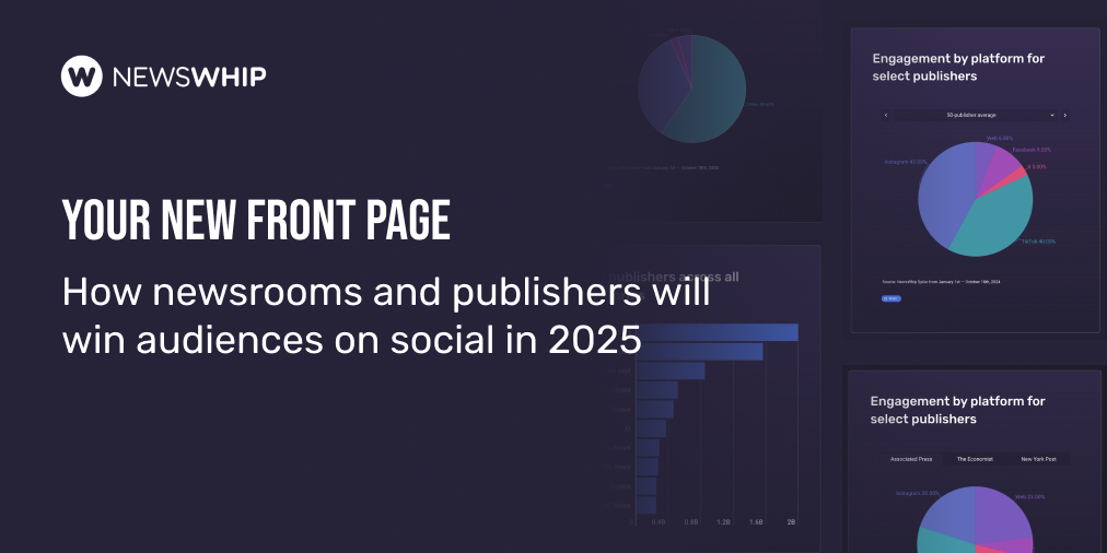
On NewsWhip’s blog, we’re starting a series on content marketing, based on lessons from our own experience. First up – should you be using infographics to tell your story?
From visualising wind speeds to illustrating womens’ rights around the world, there’s been a surge in visual storytelling from some major media outlets in recent years. Newsrooms are now looking for ‘visual journalists‘, a role that seems to encapsulate what publishers are looking to offer their increasingly mobile (and time-poor) audience.
But what about smaller organisations looking to incorporate infographics into their content marketing strategy? Infographics are great for visualising complex data or timelines, in an engaging and social media friendly way. Many use bright colours, vivid images are easily shared – perfect content marketing material. However, they don’t suit everyone.
As a start-up, here’s our advice, taken from our experience publishing some of our social news data from Spike. At NewsWhip, we don’t often use infographics, for some of the following reasons:
Good infographics require many skill-sets
Unless you decide to go with free template options like Infogram, infographics can be a demanding proposition. Excellent copy, data skills, editing, design and promotion are needed for the most basic of graphics. No one wants to see the following overloaded mess, complete with inconsistent images, fonts and headings;

As part of your content marketing strategy, you should ask yourself – are we devoting too many hours to the infographic? Do we even know if it will pay off? Which leads to our next point…
Infographics can be very time consuming
It takes times to prepare a great infographic. And after all the long hours of writing and designing, sometimes they just don’t get shared. We saw this with our September Social Stories graphic (below). The key learning is to have a strong reason for creating the infographic. We picked up just a few tweets and Facebook shares from this graphic, despite spending days in ironing it out. Don’t just assume that the hours you spend designing will be paid back in exposure.

Are there other ways you could tell your story?
When everybody is doing one thing in the content marketing space, it can be hard to be heard. At NewsWhip, we realised that infographics are useful, but don’t exactly suit our workflow. We wanted to be open, so we made our data available for download and let journalists, publishers and data buffs all over the world play with it. It’s been a great success for us, with publications like Esquire, the Guardian and the New Yorker using our data and covering NewsWhip. Don’t jump to infographics immediately – consider other formats for your output, such as podcasts, open data, or just good old informative writing.

Are you sure you can display your infographic clearly?
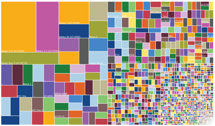
If you do go ahead, you’ve got to remember that the infographic should be in the right format for your audience. Consider how people are going to view your work of art – on their phone, while flicking through Twitter? On your blog? Will it be legible if another site picks it up and decides to repost? (Something you should be very much hoping happens). A very long infographic is not suitable for a thumbnail picture on Twitter or Facebook. You’ve got to cater for every viewing experience, or risk ending up with something illegible, like this:

Match the design with the information
Your information has to be quantifiable. Pictures should match the information. In the below example, it’s hard to understand the visuals and how they match up with the overall message. In fact, it’s hard to understand the overall message at all. Make sure your design makes sense and is easily understood.
Our verdict
At NewsWhip, we’ve used infographics in our posts before. They’re ideal in some situations, and there’s a good chance that we’ll use them again. But for the reasons above, they don’t work every time, especially for smaller organisations. For now, we’ve decided to focus on producing quality blog posts with graphs and downloadable data rather than time-consuming infographics.
Disagree with us? We want to hear more. Let us know on Twitter @newswhip.
We based much of this advice on our experience publishing data from Spike, which tracks the content that people are sharing and engaging with in real time. Brands and some of the world’s leading digital newsrooms use it to keep them ahead of the content discovery curve. Try it for free today.