We recently surveyed some of our NewsWhip Spike power users to uncover their most used and loved product features. Here’s the top 5 features they use to better understand live issues, inform whether or not to respond, and to help keep their team and stakeholders informed at all times on key topics of public interest.
1. AI Digest

The latest product innovation, AI Digest helps users to stay ahead, save time, and gain a rapid grasp of evolving topics. This recent enhancement to our existing digests combines the dependability of our trusted data with the speed of GPT-technology.
Imagine starting your day with a detailed overview of your brand, or the topics you’re interested in — whether that’s politics, tech regulation, or product innovations, or even all of the above — delivered to you on a schedule that suits you, direct to your inbox.
That’s what our new AI Digest offers. It provides a solid foundation for your day, allowing you to approach tasks with confidence, examine NewsWhip’s timeline visualization for changes in media and public interest, and prepare yourself for the primary discussion points, all in your inbox at a time you choose.
Perfect for: Comms professionals, brand managers, and anyone who needs to stay on top of hot topics and industry trends. Ideal for daily briefings and quick situational awareness.
Read more about it here.
2. Interest Quadrant

The Interest Quadrant is an innovative precision mapping tool, utilizing AI to instantly identify the people and brands driving conversations around any topic, event, or narrative.
This feature plots individuals, brands, or subjects onto one of four distinct quadrants based on public and media interest levels, serving as a strategic radar. Each quadrant offers unique insights, allowing for the swift identification of under-explored topics, potential high-interest stories, or areas where public and media interests may not align.
Perfect for: Journalists, researchers, strategists, and comms professionals. Ideal for uncovering emerging stories, identifying whitespace opportunities, and tracking the shifting sands of evolving narratives.
Read more about it here.
3. Highest velocity metric

The Highest velocity metric is a pivotal tool for gauging the rate at which a story or topic gains momentum. By tracking the speed of new interactions with an article or post at regular intervals, this metric pinpoints the peak pace of audience engagement.
It’s an invaluable asset for identifying stories that are rapidly gaining traction, effectively highlighting content that’s capturing public interest at an extraordinary rate. Whether it’s for spotting a breaking story or conducting a reflective analysis post-event, the metric stands out as a key indicator of a story’s virality, offering insights into how and why certain content is resonating with audiences.
By comparing different stories within a specific search, users can discern the fastest spreading narratives, providing a clearer understanding of the media landscape.
Perfect for: Journalists, media analysts and social media managers needing to identify rapidly trending stories. Ideal for keeping a pulse on viral content and shaping responsive strategies in real-time.
Read more about it here.
4. Timeline visualization

The Timeline widget in NewsWhip Spike is a one of a kind visual insight that helps our users quickly understand the evolution of media and public interest. It tracks the number of articles published and social media interactions, providing a time series analysis that’s not just informative but dynamically visual. The timeline widget is three years old and has quickly become a go-to source of rapid insights for many of our users.
The widget’s capability to combine multiple timelines offers a comparative view, crucial for contrasting different stories or topics. This deepens your understanding of varying narratives. It also integrates with our Highlights feature which pinpoints significant peaks and tells you what has been driving changes in the public interest and media interest.
Furthermore, the option to export data in formats like PowerPoint, PNG, or CSV makes sharing these insights seamless, fitting perfectly into any communication strategy.
Perfect for: All users seeking a clear visual representation of media and public interest over time. Ideal for event analysis, competitor comparisons, and monitoring the impact of campaigns or crises.
Read more about it here.
5. Predicted interactions metric

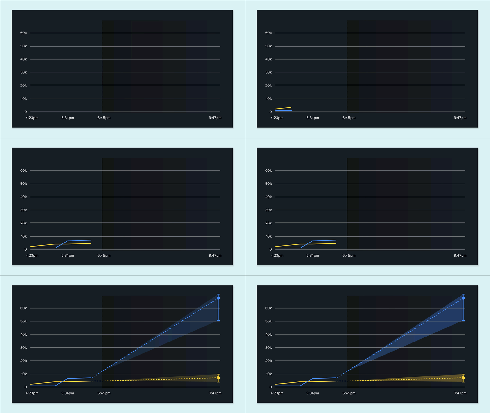
And last but by no means least is our patented and powerful predicted interactions metric, an advanced tool that offers foresight into the virality of content that you can’t get anywhere else. It operates by analyzing the frequency of social interactions on articles over time, using this data to create a time-series analysis.
A predictive analytics technique is then applied, forecasting the number of interactions an article is expected to receive in the future. This feature is particularly adept at identifying trending articles and posts, allowing users to anticipate and leverage emerging popular content.
Whether it’s a slow news day or a busy one, the metric adapts, offering predictions over varying time frames – from as short as 30 minutes to up to 24 hours. This metric is not just about tracking current popularity; it’s about predicting future trends, making it an essential tool for strategists and content creators looking to stay ahead in a rapidly changing media environment.
Perfect for: Communication and PR teams, crisis management specialists, and social media strategists assessing whether a story will gain significant traction. Ideal for preparing for potential damage control or strategically joining a trending narrative.
Read more about it here.


